::vue-school-link{class="mt-6" lesson="sidebars-in-shadcn-vue" placement="top"} 观看一段关于使用 shadcn-vue 构建侧边栏的 Vue School 视频。::
侧边栏是最复杂的组件之一。它们是任何应用的核心,并且通常包含许多可移动部分。
🌐 Sidebars are one of the most complex components to build. They are central to any application and often contain a lot of moving parts.
我不喜欢构建侧边栏。所以我建了30多个。各种配置都有。然后我把核心组件提取到 Sidebar*.vue 中。
🌐 I don't like building sidebars. So I built 30+ of them. All kinds of
configurations. Then I extracted the core components into Sidebar*.vue.
我们现在有了一个坚实的基础可以在其上构建。可组合。可主题化。可自定义。
🌐 We now have a solid foundation to build on top of. Composable. Themeable. Customizable.
安装
🌐 Installation
结构
🌐 Structure
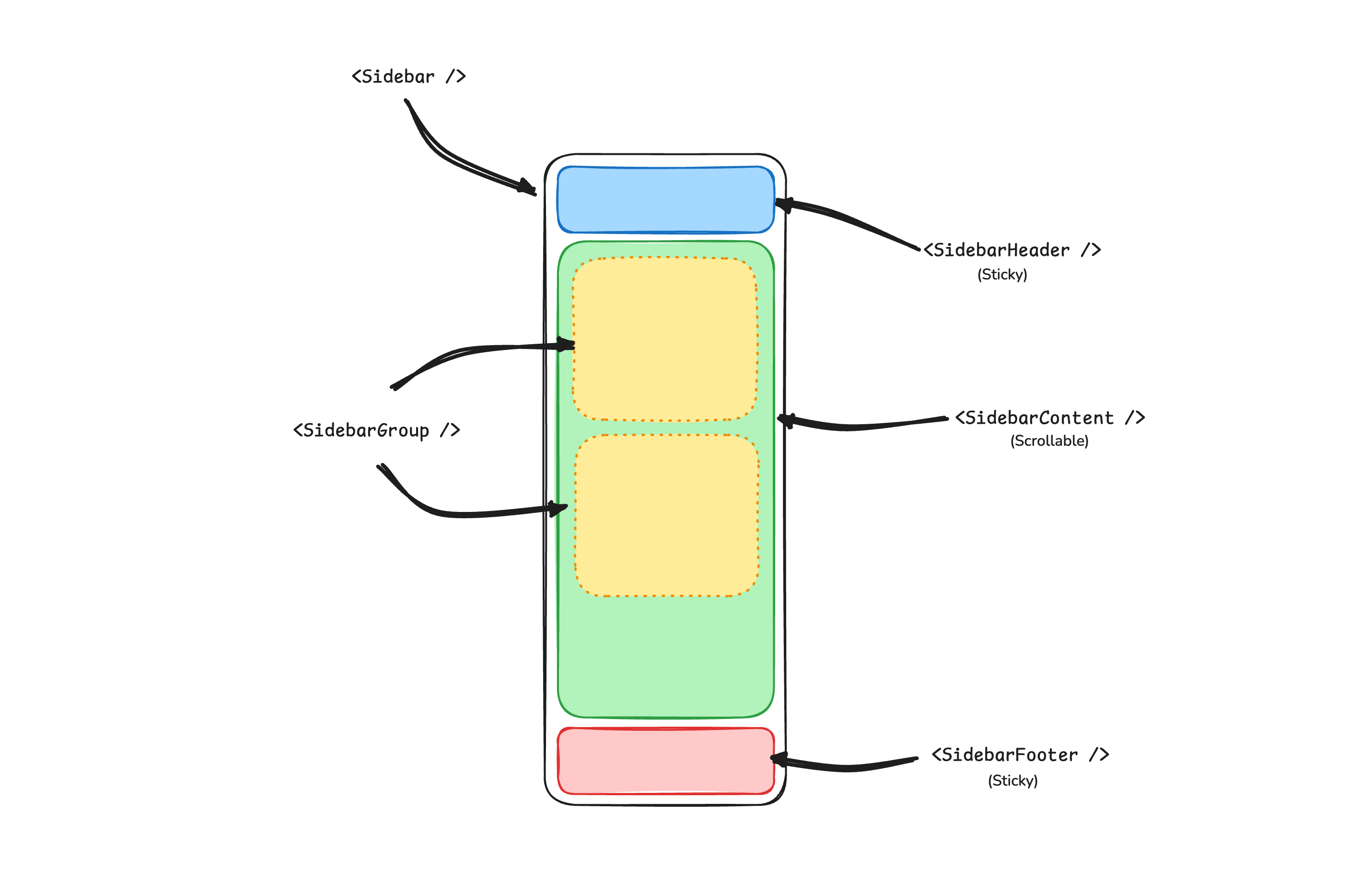
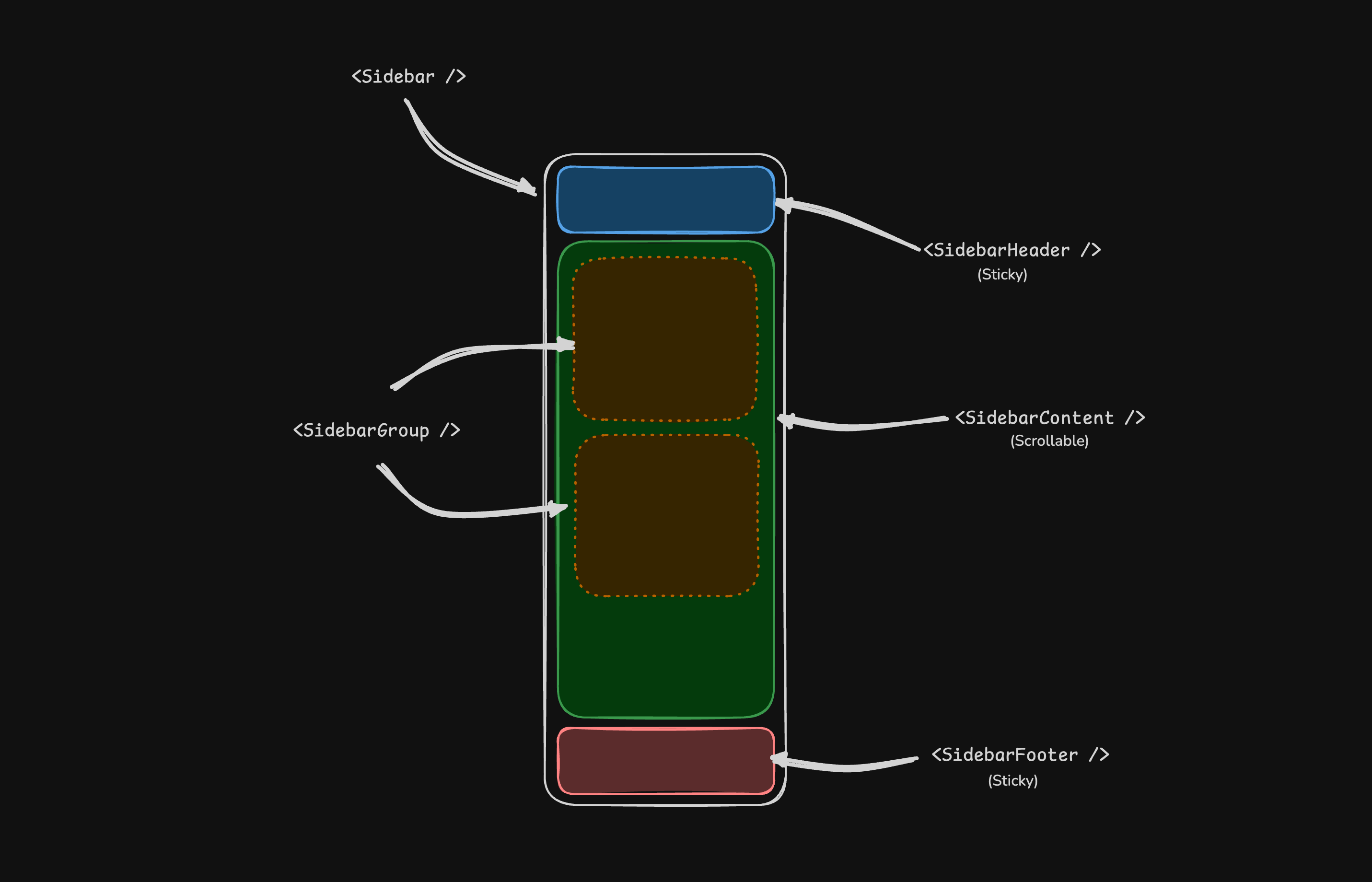
一个 Sidebar 组件由以下部分组成:
🌐 A Sidebar component is composed of the following parts:
SidebarProvider- 处理可折叠状态。Sidebar- 侧边栏容器。SidebarHeader和 SidebarFooter - 固定在侧边栏的顶部和底部SidebarContent- 可滚动内容。SidebarGroup- 侧边栏内容中的部分。SidebarTrigger- 侧边栏触发器
用法
🌐 Usage
<script setup lang="ts">
import {
Sidebar,
SidebarContent,
SidebarFooter,
SidebarGroup,
SidebarGroupContent,
SidebarGroupLabel,
SidebarHeader,
SidebarInset,
SidebarMenu,
SidebarMenuButton,
SidebarMenuItem,
SidebarProvider,
SidebarRail,
SidebarTrigger,
} from '@/components/ui/sidebar'
</script>
<template>
<SidebarProvider>
<Sidebar>
<SidebarHeader>
<SidebarMenu>
<SidebarMenuItem>
<SidebarMenuButton size="lg">
<div class="flex aspect-square size-8 items-center justify-center rounded-lg bg-sidebar-primary text-sidebar-primary-foreground">
<GalleryVerticalEnd class="size-4" />
</div>
<div class="grid flex-1 text-left text-sm leading-tight">
<span class="truncate font-semibold">Acme Inc</span>
<span class="truncate text-xs">Enterprise</span>
</div>
</SidebarMenuButton>
</SidebarMenuItem>
</SidebarMenu>
</SidebarHeader>
<SidebarContent>
<SidebarGroup>
<SidebarGroupLabel>Platform</SidebarGroupLabel>
<SidebarGroupContent>
<SidebarMenu>
<SidebarMenuItem>
<SidebarMenuButton as-child>
<a href="#">
<Home />
<span>Home</span>
</a>
</SidebarMenuButton>
</SidebarMenuItem>
</SidebarMenu>
</SidebarGroupContent>
</SidebarGroup>
</SidebarContent>
<SidebarFooter />
<SidebarRail />
</Sidebar>
<SidebarInset>
<header class="flex h-16 shrink-0 items-center gap-2 transition-[width,height] ease-linear group-has-[[data-collapsible=icon]]/sidebar-wrapper:h-12">
<div class="flex items-center gap-2 px-4">
<SidebarTrigger class="-ml-1" />
</div>
</header>
<div class="flex flex-1 flex-col gap-4 p-4 pt-0">
<div class="grid auto-rows-min gap-4 md:grid-cols-3">
<div class="aspect-video rounded-xl bg-muted/50" />
<div class="aspect-video rounded-xl bg-muted/50" />
<div class="aspect-video rounded-xl bg-muted/50" />
</div>
<div class="min-h-[100vh] flex-1 rounded-xl bg-muted/50 md:min-h-min" />
</div>
</SidebarInset>
</SidebarProvider>
</template>你的第一个侧边栏
🌐 Your First Sidebar
让我们从最基本的侧边栏开始,一个带有菜单的可折叠侧边栏。
🌐 Let's start with the most basic sidebar A collapsible sidebar with a menu.
::步骤
在应用的根目录添加 SidebarProvider 和 SidebarTrigger
::
<script setup lang="ts">
import AppSidebar from '@/components/AppSidebar.vue'
import { SidebarProvider, SidebarTrigger } from '@/components/ui/sidebar'
</script>
<template>
<SidebarProvider>
<AppSidebar />
<main>
<SidebarTrigger />
<slot />
</main>
</SidebarProvider>
</template>::步骤
在 @/components/AppSidebar.vue 创建一个新的侧边栏组件
::
<script setup lang="ts">
import { Sidebar, SidebarContent } from '@/components/ui/sidebar'
</script>
<template>
<Sidebar>
<SidebarContent />
</Sidebar>
</template>::步骤
现在,让我们在侧边栏添加一个 SidebarMenu
::
我们将在 SidebarGroup 中使用 SidebarMenu 组件。
<script setup lang="ts">
import { Calendar, Home, Inbox, Search, Settings } from 'lucide-vue-next'
import {
Sidebar,
SidebarContent,
SidebarGroup,
SidebarGroupContent,
SidebarGroupLabel,
SidebarMenu,
SidebarMenuButton,
SidebarMenuItem,
} from '@/components/ui/sidebar'
// Menu items.
const items = [
{
title: 'Home',
url: '#',
icon: Home,
},
{
title: 'Inbox',
url: '#',
icon: Inbox,
},
{
title: 'Calendar',
url: '#',
icon: Calendar,
},
{
title: 'Search',
url: '#',
icon: Search,
},
{
title: 'Settings',
url: '#',
icon: Settings,
},
]
</script>
<template>
<Sidebar>
<SidebarContent>
<SidebarGroup>
<SidebarGroupLabel>Application</SidebarGroupLabel>
<SidebarGroupContent>
<SidebarMenu>
<SidebarMenuItem v-for="item in items" :key="item.title">
<SidebarMenuButton as-child>
<a :href="item.url">
<component :is="item.icon" />
<span>{{ item.title }}</span>
</a>
</SidebarMenuButton>
</SidebarMenuItem>
</SidebarMenu>
</SidebarGroupContent>
</SidebarGroup>
</SidebarContent>
</Sidebar>
</template>::步骤 你已经创建了你的第一个侧边栏。 ::
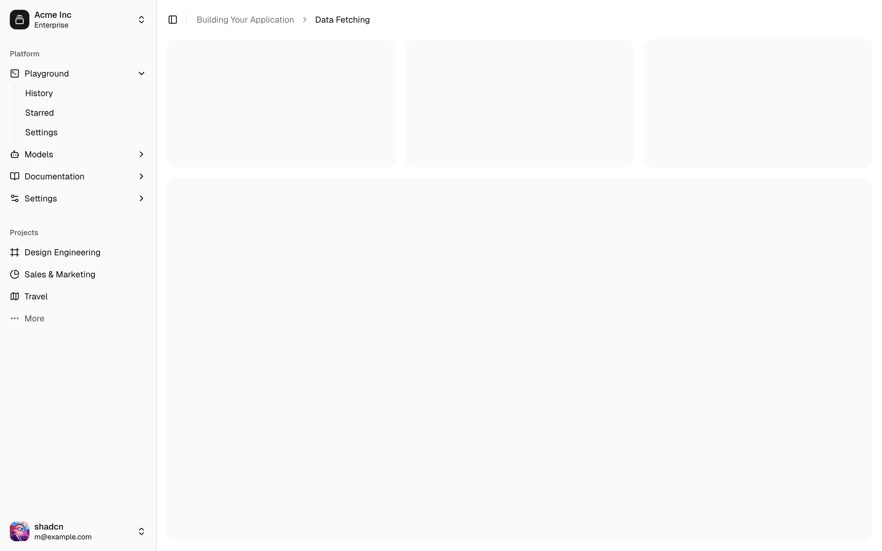
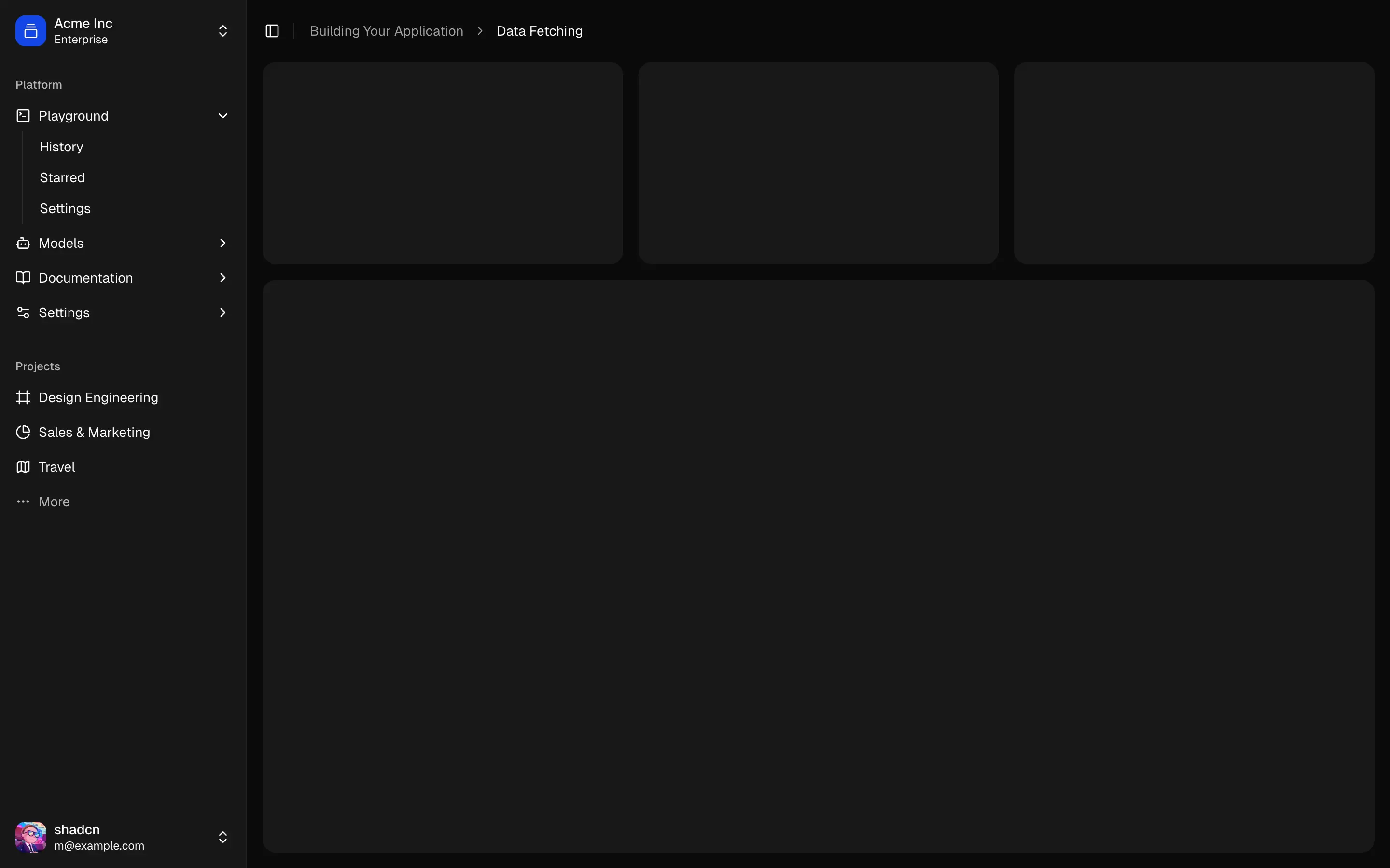
你应该会看到类似这样的东西:


组件
🌐 Components
Sidebar*.vue 文件中的组件是可组合的,即你可以通过将提供的组件组合在一起来构建你的侧边栏。它们也可以很好地与其他 shadcn-vue 组件如 DropdownMenu、Collapsible、Dialog 等组合使用。
🌐 The components in the Sidebar*.vue files are built to be composable i.e you build your sidebar by putting the provided components together. They also compose well with other shadcn-vue components such as DropdownMenu, Collapsible, Dialog, etc.
如果你需要更改 Sidebar*.vue 文件中的代码,我们鼓励你这样做。代码属于你自己。使用提供的组件作为起点来构建你自己的代码
SidebarProvider
SidebarProvider 组件用于向其所有子组件提供侧边栏上下文。
🌐 The SidebarProvider component is used to provide the sidebar context to all its children.
属性
🌐 Props
SidebarProvider 组件接受以下属性:
🌐 The SidebarProvider component accepts the following props:
宽度
🌐 Width
使用 defaultOpen、open 和 onOpenChange 属性来控制侧边栏的打开状态。
🌐 Use the defaultOpen, open, and onOpenChange props to control the open state of the sidebar.
<script setup lang="ts">
import { ref } from 'vue'
const open = ref(false)
</script>
<template>
<SidebarProvider :open="open" @update:open="open = $event">
<!-- ... -->
</SidebarProvider>
</template>键盘快捷方式
🌐 Keyboard Shortcut
SidebarProvider 组件支持使用键盘快捷键切换侧边栏。默认快捷键是 cmd+b 或 ctrl+b。
🌐 The SidebarProvider component supports keyboard shortcuts to toggle the sidebar. The default shortcut is cmd+b or ctrl+b.
<SidebarProvider>
<!-- ... -->
</SidebarProvider>持久状态
🌐 Persisted State
要持久化侧边栏状态,你可以在 SidebarProvider 组件上使用 storageKey 属性。
🌐 To persist the sidebar state, you can use the storageKey prop on the SidebarProvider component.
<SidebarProvider storage-key="sidebar">
<!-- ... -->
</SidebarProvider><SidebarProvider
:default-open="false"
storage-key="sidebar"
class="flex min-h-screen"
>
<!-- ... -->
</SidebarProvider>侧边栏
🌐 Sidebar
主侧边栏组件。
🌐 The main sidebar component.
<Sidebar>
<SidebarHeader />
<SidebarContent />
<SidebarFooter />
</Sidebar>属性
🌐 Props
Sidebar 组件接受以下属性:
🌐 The Sidebar component accepts the following props:
side
使用 side 属性来设置侧边栏的位置。
🌐 Use the side prop to set the side of the sidebar.
<Sidebar side="left">
<!-- ... -->
</Sidebar>variant
使用 variant 属性来设置侧边栏的变体。
🌐 Use the variant prop to set the variant of the sidebar.
<!-- Default variant -->
<Sidebar variant="sidebar">
<!-- ... -->
</Sidebar><!-- Floating variant -->
<Sidebar variant="floating">
<!-- ... -->
</Sidebar><!-- Inset variant -->
<Sidebar variant="inset">
<!-- ... -->
</Sidebar>collapsible
使用 collapsible 属性可以使侧边栏可折叠。
🌐 Use the collapsible prop to make the sidebar collapsible.
<Sidebar collapsible="icon">
<!-- ... -->
</Sidebar><Sidebar collapsible="offcanvas">
<!-- ... -->
</Sidebar>useSidebar
useSidebar 钩子用于控制侧边栏。
🌐 The useSidebar hook is used to control the sidebar.
<script setup lang="ts">
import { useSidebar } from '@/components/ui/sidebar'
const {
state,
open,
setOpen,
openMobile,
setOpenMobile,
isMobile,
toggleSidebar,
} = useSidebar()
</script>SidebarHeader
用于呈现侧边栏标题。
🌐 Used to render the sidebar header.
<Sidebar>
<SidebarHeader>
<SidebarMenu>
<SidebarMenuItem>
<SidebarMenuButton size="lg">
<div class="flex aspect-square size-8 items-center justify-center rounded-lg bg-sidebar-primary text-sidebar-primary-foreground">
<GalleryVerticalEnd class="size-4" />
</div>
<div class="flex flex-col gap-0.5 leading-none">
<span class="font-semibold">Documentation</span>
<span class="">v1.0.0</span>
</div>
</SidebarMenuButton>
</SidebarMenuItem>
</SidebarMenu>
</SidebarHeader>
</Sidebar>SidebarFooter
用于呈现侧边栏页脚。
🌐 Used to render the sidebar footer.
<Sidebar>
<SidebarFooter>
<SidebarMenu>
<SidebarMenuItem>
<DropdownMenu>
<DropdownMenuTrigger as-child>
<SidebarMenuButton>
<User2 /> Username
<ChevronUp class="ml-auto" />
</SidebarMenuButton>
</DropdownMenuTrigger>
<DropdownMenuContent
side="top"
class="w-(--reka-popper-anchor-width)"
>
<DropdownMenuItem>
<span>Account</span>
</DropdownMenuItem>
<DropdownMenuItem>
<span>Billing</span>
</DropdownMenuItem>
<DropdownMenuItem>
<span>Sign out</span>
</DropdownMenuItem>
</DropdownMenuContent>
</DropdownMenu>
</SidebarMenuItem>
</SidebarMenu>
</SidebarFooter>
</Sidebar>SidebarContent
侧边栏的可滚动内容区域。
🌐 The scrollable content area of the sidebar.
<Sidebar>
<SidebarContent>
<SidebarGroup />
<SidebarGroup />
</SidebarContent>
</Sidebar>SidebarGroup
用于分组侧边栏菜单项。
🌐 Used to group sidebar menu items.
<SidebarContent>
<SidebarGroup>
<SidebarGroupLabel>Application</SidebarGroupLabel>
<SidebarGroupContent>
<!-- SidebarMenu -->
</SidebarGroupContent>
</SidebarGroup>
</SidebarContent>可折叠侧边栏组
🌐 Collapsible SidebarGroup
要使 SidebarGroup 可折叠,将其封装在 Collapsible 组件中。
🌐 To make a SidebarGroup collapsible, wrap it in a Collapsible component.
<SidebarGroup as-child>
<Collapsible default-open class="group/collapsible">
<SidebarGroupLabel as-child>
<CollapsibleTrigger class="group/label w-full text-left text-sm text-sidebar-foreground hover:bg-sidebar-accent hover:text-sidebar-accent-foreground [&[data-state=open]>svg]:rotate-90">
Help
<ChevronRight class="ml-auto transition-transform group-data-[state=open]/collapsible:rotate-90" />
</CollapsibleTrigger>
</SidebarGroupLabel>
<CollapsibleContent>
<SidebarGroupContent>
<SidebarMenu>
<!-- Menu items -->
</SidebarMenu>
</SidebarGroupContent>
</CollapsibleContent>
</Collapsible>
</SidebarGroup>SidebarGroupAction
SidebarGroupAction 组件用于在侧边栏组标题中渲染操作按钮。
🌐 The SidebarGroupAction component is used to render an action button in the sidebar group header.
<SidebarGroup>
<SidebarGroupLabel>
Projects
<SidebarGroupAction>
<Plus /> <span class="sr-only">Add Project</span>
</SidebarGroupAction>
</SidebarGroupLabel>
<SidebarGroupContent></SidebarGroupContent>
</SidebarGroup>SidebarMenu
SidebarMenu 组件用于在侧边栏中渲染菜单。
🌐 The SidebarMenu component is used to render a menu in the sidebar.
<SidebarGroupContent>
<SidebarMenu>
<SidebarMenuItem>
<SidebarMenuButton as-child>
<a href="#">
<Home />
<span>Home</span>
</a>
</SidebarMenuButton>
</SidebarMenuItem>
<SidebarMenuItem>
<SidebarMenuButton as-child>
<a href="#">
<Inbox />
<span>Inbox</span>
</a>
</SidebarMenuButton>
</SidebarMenuItem>
</SidebarMenu>
</SidebarGroupContent>SidebarMenuButton
SidebarMenuButton 组件用于在侧边栏中呈现菜单按钮。
🌐 The SidebarMenuButton component is used to render a menu button in the sidebar.
链接或锚点
🌐 Link or Anchor
使用 as-child 属性将 SidebarMenuButton 渲染为链接或锚点。
🌐 Use the as-child prop to render the SidebarMenuButton as a link or anchor.
<SidebarMenuButton as-child>
<a href="#">
<Home />
<span>Home</span>
</a>
</SidebarMenuButton>图标和标签
🌐 Icon and Label
你可以在 SidebarMenuButton 组件中渲染图标和标签。
🌐 You can render an icon and label in the SidebarMenuButton component.
<SidebarMenuButton>
<Home />
<span>Home</span>
</SidebarMenuButton>isActive
使用 isActive 属性将菜单按钮标记为活动状态。
🌐 Use the isActive prop to mark a menu button as active.
<SidebarMenuButton :is-active="true">
<Home />
<span>Home</span>
</SidebarMenuButton>SidebarMenuAction
SidebarMenuAction 组件用于在侧边栏中呈现菜单操作。
🌐 The SidebarMenuAction component is used to render a menu action in the sidebar.
<SidebarMenuItem>
<SidebarMenuButton>
<Home />
<span>Home</span>
</SidebarMenuButton>
<SidebarMenuAction>
<MoreHorizontal />
</SidebarMenuAction>
</SidebarMenuItem>DropdownMenu
你可以将 SidebarMenuAction 组件与 DropdownMenu 组件一起使用。
🌐 You can use the SidebarMenuAction component with a DropdownMenu component.
<SidebarMenuItem>
<SidebarMenuButton>
<Home />
<span>Home</span>
</SidebarMenuButton>
<DropdownMenu>
<DropdownMenuTrigger as-child>
<SidebarMenuAction>
<MoreHorizontal />
</SidebarMenuAction>
</DropdownMenuTrigger>
<DropdownMenuContent side="right" align="start">
<DropdownMenuItem>
<span>Edit Project</span>
</DropdownMenuItem>
<DropdownMenuItem>
<span>Delete Project</span>
</DropdownMenuItem>
</DropdownMenuContent>
</DropdownMenu>
</SidebarMenuItem>SidebarMenuSub
SidebarMenuSub 组件用于在侧边栏中渲染子菜单。
🌐 The SidebarMenuSub component is used to render a submenu in the sidebar.
<SidebarMenuItem>
<SidebarMenuButton>
<Home />
<span>Home</span>
</SidebarMenuButton>
<SidebarMenuSub>
<SidebarMenuItem>
<SidebarMenuButton>
<span>History</span>
</SidebarMenuButton>
</SidebarMenuItem>
<SidebarMenuItem>
<SidebarMenuButton>
<span>Starred</span>
</SidebarMenuButton>
</SidebarMenuItem>
</SidebarMenuSub>
</SidebarMenuItem>可折叠侧边菜单
🌐 Collapsible SidebarMenu
要使 SidebarMenu 可折叠,将其封装在 Collapsible 组件中。
🌐 To make a SidebarMenu collapsible, wrap it in a Collapsible component.
<SidebarMenuItem>
<Collapsible default-open class="group/collapsible">
<CollapsibleTrigger as-child>
<SidebarMenuButton>
<Home />
<span>Home</span>
<ChevronRight class="ml-auto transition-transform group-data-[state=open]/collapsible:rotate-90" />
</SidebarMenuButton>
</CollapsibleTrigger>
<CollapsibleContent>
<SidebarMenuSub>
<SidebarMenuItem>
<SidebarMenuButton>
<span>History</span>
</SidebarMenuButton>
</SidebarMenuItem>
<SidebarMenuItem>
<SidebarMenuButton>
<span>Starred</span>
</SidebarMenuButton>
</SidebarMenuItem>
</SidebarMenuSub>
</CollapsibleContent>
</Collapsible>
</SidebarMenuItem>SidebarMenuBadge
SidebarMenuBadge 组件用于在侧边栏菜单中渲染徽章。
🌐 The SidebarMenuBadge component is used to render a badge in the sidebar menu.
<SidebarMenuButton>
<Home />
<span>Home</span>
<SidebarMenuBadge>24</SidebarMenuBadge>
</SidebarMenuButton>SidebarMenuSkeleton
你可以使用 SidebarMenuSkeleton 组件在侧边栏菜单中渲染骨架加载器。
🌐 You can use the SidebarMenuSkeleton component to render a skeleton loader in the sidebar menu.
<SidebarMenu>
<SidebarMenuItem v-for="item in Array.from({ length: 5 })" :key="item">
<SidebarMenuSkeleton />
</SidebarMenuItem>
</SidebarMenu>SidebarSeparator
SidebarSeparator 组件用于在侧边栏中渲染分隔符。
🌐 The SidebarSeparator component is used to render a separator in the sidebar.
<SidebarContent>
<SidebarGroup />
<SidebarSeparator />
<SidebarGroup />
</SidebarContent>SidebarTrigger
SidebarTrigger 组件用于渲染侧边栏的触发按钮。
🌐 The SidebarTrigger component is used to render a trigger button for the sidebar.
<SidebarTrigger />自定义触发器
🌐 Custom Trigger
你可以使用 useSidebar 钩子创建自定义触发器。
🌐 You can create a custom trigger using the useSidebar hook.
<script setup lang="ts">
import { useSidebar } from '@/components/ui/sidebar'
const { toggleSidebar } = useSidebar()
</script>
<template>
<Button @click="toggleSidebar">
Toggle Sidebar
</Button>
</template>SidebarRail
SidebarRail 组件用于在侧边栏中渲染轨道。通常在侧边栏折叠时,用于在悬停时切换侧边栏。
🌐 The SidebarRail component is used to render a rail in the sidebar. This is usually used to toggle the sidebar on hover when the sidebar is collapsed.
<Sidebar collapsible="icon">
<SidebarHeader />
<SidebarContent />
<SidebarFooter />
<SidebarRail />
</Sidebar>受控侧边栏
🌐 Controlled Sidebar
使用 open 和 onOpenChange 属性来控制侧边栏。
🌐 Use the open and onOpenChange props to control the sidebar.
<script setup lang="ts">
import { ref } from 'vue'
const open = ref(false)
</script>
<template>
<SidebarProvider :open="open" @update:open="open = $event">
<Sidebar />
</SidebarProvider>
</template>主题
🌐 Theming
你可以使用 CSS 变量来设置侧边栏的主题。
🌐 You can theme the sidebar using CSS variables.
@layer base {
:root {
--sidebar-background: 0 0% 98%;
--sidebar-foreground: 240 5.3% 26.1%;
--sidebar-primary: 240 5.9% 10%;
--sidebar-primary-foreground: 0 0% 98%;
--sidebar-accent: 240 4.8% 95.9%;
--sidebar-accent-foreground: 240 5.9% 10%;
--sidebar-border: 220 13% 91%;
--sidebar-ring: 217.2 91.2% 59.8%;
}
.dark {
--sidebar-background: 240 5.9% 10%;
--sidebar-foreground: 240 4.8% 95.9%;
--sidebar-primary: 224.3 76.3% 48%;
--sidebar-primary-foreground: 0 0% 100%;
--sidebar-accent: 240 3.7% 15.9%;
--sidebar-accent-foreground: 240 4.8% 95.9%;
--sidebar-border: 240 3.7% 15.9%;
--sidebar-ring: 217.2 91.2% 59.8%;
}
}样式
🌐 Styling
这里有一些侧边栏样式的技巧:
🌐 Here are some tips for styling the sidebar:
- 使用
data-sidebar和data-state属性来设置侧边栏的样式。 - 侧边栏会自动设置
--sidebar-widthCSS 变量。你可以使用它来调整主内容的布局。